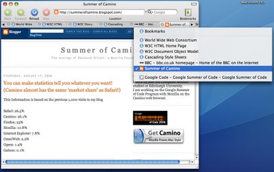
This pop-up menu is only visible when tabs are overflowing, it allows quick access to any tab and also provides a contextual overview of all of your tabs.
Tabs above the first divider are overflowing to the left, tabs after the 2nd divider are overflowing to the right. This is just a little sneak peak because there are still some interesting problems to iron out before I could even dream of showing a video. A massive thanks to James for suggesting the dividers idea in the comments.
The buttons at either side are capable of showing their state - they are greyed out when it is not possible to scroll any further in that direction.
After I properly hack the code relating to selecting a menu item, the tabs will slide to show this tab in the tab bar.
I am much happier with the interface that I am now working on.
I'm off out to the pub to have a birthday beer with my friends.
Thursday, August 17, 2006
T-4: A sneak preview
Subscribe to:
Post Comments (Atom)

5 comments:
Looking good.
Why duplicate visible tabs in the menu?
You can access these right by clicking on them.
I believe you should hide these from the menu, conserving the separator to differentiate left tabs from tight tabs.
Yep, the dividers work really well! Is Jasper going to be involved in the arrow graphics?
One downside to the one-menu approach is that the ordering of ease-of-access to tabs when using it will be from extreme left to extreme right. The ease of getting to the visible tabs in the menu is largely irrelevant of course, but:
1) the right-hand spillover will be significantly harder to get to than the left-hand spillover, and
2) getting to the most distant left spillover tabs will be easier than getting to the closest left spillover tabs (while the opposite will be true for the right spillover).
That gives a very asymmetrical access model.
Perhaps this menu belongs somewhere else (the Window menu?), with the original dual-spillover menus staying in the tab bar (as right-click/click-hold features of the scroll arrows, if the extra button space is undesirable).
val1984: It gives the user an idea of where the currently visible tabs are with respect to all their open tabs. It's just an idea.
jon: I hope so but he has been afk for a long time.
stuart: Thanks for the feedback, I'll be sure to talk that over with other developers and designers so that we can reach an agreement over your concern.
Post a Comment