A more solid proposal for how overflow management and tab dragging could work in Camino in the future. I've spent a lot of time this summer working on ideas that were never really well set, but I've done a lot of listening and this almost feels like what people are expecting to see
An overview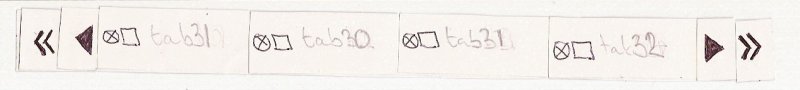
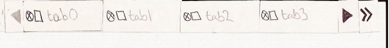
When you open up too many tabs to fit in the tab bar then overflow management will change the appearance of the tab bar as shown above. This new tab bar has a set of pop-up menu buttons - one at either side - and a set of scroll buttons - one at either side. This allows people who use tabs heavily to retain their access to the pop-up menu that they are used to, or for casual users to use the scroll buttons like they would in Finder.
The pop-up buttons
The pop-up buttons at either side behave exactly as the single pop-up button currently behaves in Camino, with a few extensions.
When you click on a pop-up button it presents you with a list of tabs that are overflown at that side. This keeps a sense of position in the tab bar over the currently visible tabs. If you click on a tab from the pop-up menu then that tab is made either left-most or right-most in the tab bar - this depends on whether or not you click on a menu item in the left or right pop-up menu respectively.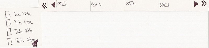
As a result of selecting the tab at the bottom of this list you have selected to make the first tab left-most. One of the complaints I have received with regards to what I was working on was that it was difficult to tell whether or not you could scroll in a direction anymore because the difference between an active and inactive button is not always obvious.
An attempt to deal with this is to remove the pop-up menu button and scroll button from the tab bar if there are no overflown tabs in that direction. I believe that this goes some way towards eliminating any such confusion.
The scroll buttons
The scroll buttons allow you to slide along the tabs to change the tabs that are currently visible in the tab bar. You can click and hold the mouse on a button and the tabs will continue to slide in that direction until you release the mouse, or, there are no more tabs left to slide.

Dragging tabs
Dragging tabs is something that people have been asking to be able to do for years. The way that is is done in the bookmark bar does not give you much feedback while you are dragging and plans are to make tab dragging more interactive.
To drag a tab you can pull the tab out of the tab bar. This will cause the surrounding tabs to slide to fill in the space that the tab you are dragging is leaving.
If you want to drop the tab within the current set of visible tabs then just drag it back into the tab bar and this places that tab where your mouse pointer is located at. This happens while you are dragging the tab, letting go of the tab finalises the placement. Pressing escape will allow you to change your mind and the tab will go back to where it was before you started the drag.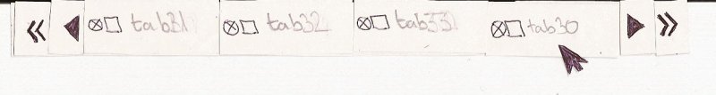
Dragging to a totally different part of the tab bar
If you want to drag a tab from it's current location to a totally different part of the tab bar then you can hover over a scroll button with a tab image dragging. This will cause the tabs to slide in that direction until you find where you want to put your tab.
When you have found where you want to put your tab, move the mouse pointer away from the scroll button and drag it into the tab bar to place it there. Easy.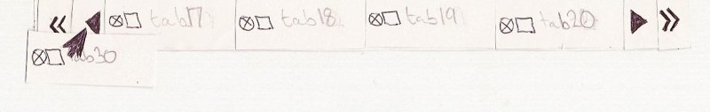

One of the problems with dragging is that if you have access to a pop-up menu and a scroll button you might think you can drag and drop into the pop-up menu. That is not possible using Apple's implementation and I've already spent the summer twisting the way that tab view items work so the thought of twisting pop-up menus is daunting. In short, you will not be able to drag a tab into a pop up menu until Apple support that.
Some questions:
- Is the UI too clunky having both a pop-up menu button and a scroll button? Would it be better to have a scroll button that allowed access to a pop-up menu using a right-click or a Command-click?
- Are there any really obvious defects in this design that I just cannot see because I've spent nearly my whole summer working on it?
Hope to receive some really useful feedback so that what I am now working on will be what people expect to see in Camino.
Edit
After some great feedback, I'm looking at this...
When tabs are overflowing there are 2 buttons at either side which show an enabled or disabled state depending on whether or not you can scroll in that direction. There is also a pop-up menu at the far side of the tab bar which contains a list of all the tabs that you have open.
When you click on the pop-up button the tick represents that tab that is currently selcted, as you can see, the tab with title "tab2" is the selected tab.
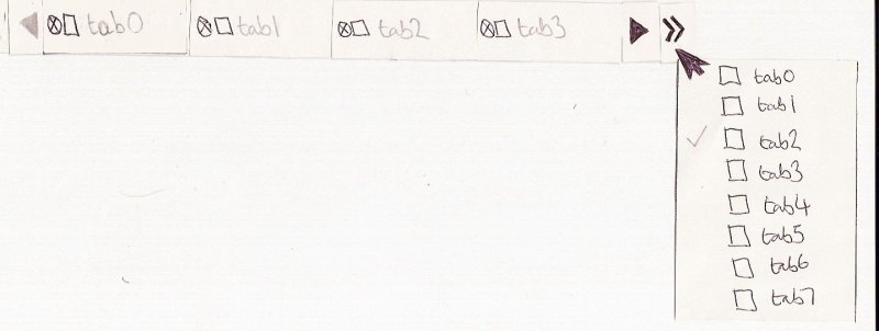
If you select a tab that is not currently being shown in the tab bar then the tabs slide to show this tab in the tab bar. Perhaps in the middle as has been suggested.


12 comments:
I am leaving this comment to reflect Samuel's thoughts:
23:45 <@ss|work> Removing buttons is frowned upon.
23:46 <@ss|work> Making them disabled, and actually look disabled, would be good enough.
23:54 <@ss|work> Also, I'm not sure about having two buttons one each side.
23:54 <@ss|work> I thought the idea was to make ctrl-click on the icons popup the menu.
23:55 < delliott> Would it seem natural to modifier-click on a button to open a pop-up menu?
23:56 <@ss|work> Well
23:56 <@ss|work> You can do it on tabs and bookmark bar items
23:57 <@ss|work> I think it'd make sense, but someone else should agree before you go that route.
23:57 < delliott> Yeah, the only concern is that you cannot do it elsewhere in OS X so it might be something that could benefit people using Camino that they'd not notice.
23:59 <@ss|work> But this is unique UI.
23:59 <@ss|work> Where else in OS X do things like this exist?
I'm probably not the first to propose a solution which just uses scroll buttons. In my opinion, they should have two behaviors:
1. Click and release causes a window's worth of tabs to scroll over (like the behavior of the left/right arrows in the widget dock at the bottom of Dashboard).
2. Click and hold to get the usual pop up menu for the tabs that are not visible (similar to the behavior of the forward and back buttons in Safari and Camino, which pop up your history/future if you click and hold).
Using a Dashboard-esque solution also suggests an aesthetic treatment for the arrow buttons which will cause the tabs to scroll (maybe even expanding to say "page 1 of 3" when on hover, as in Dashboard).
--Tim
One problem with having two tab menus (one on the left, one on the right) is that it forces people to remember which side their tab is overflown on. Especially in a situation where the tabs in each menu are constantly changing depending on where I've scrolled to, two tab menus might ultimately make tab management by menu kind of inconvenient.
A solution might be to have two scroll buttons but just a single tab menu (at the far right of the tab bar, where we're used to seeing it?). To reduce confusion about where tabs will be listed, it would list every open tab (maybe even the ones you can see).
Just another two cents. It's been really interesting to watch the development of your thinking on tab management -- even as a pencil sketch, I think it's starting to look pretty elegant.
And hey, happy birthday!
-- Tim
Hi,
I agree with ss on disabled widgets, they should not disappear.
Ctrl-clicking (or right-clicking) on the slider is good enough for me because if you choose your solution, it would take nearly 4 times as much space as the overflow widget we have today.
I have a suggestion : would it be possible to make the mouse scroll wheel scrolling the tab bar when hovering it?
Thanks :)
I agree with Sam; as much as I'd like to still have 2-click access to all of my tabs, two buttons on both sides is too clunkly for Camino's UI and takes up too much space (and 3-click access should be a workable compromise).
I'm not too worried about making sure this behavior has a counterpart in the OS; the people who use the menu (and find it useful more of the time than not) are the heavy users of tabs, and they'll be able to figure the behavior out, and, as Sam notes, everything else on the tab bar already responds to Ctrl-click ;)
The best example of modifier-click on an otherwise-unsuspecting widget bringing up a menu is the Cmd-click on title bar menu (we don't do this in Camino yet, but the rest of the OS does), so there are examples. (As I said, I'm not concerned that we rigidly insist on an OS counterpart, but if we choose Cmd instead of Ctrl here, there should be some discussion first, given the meaning(s) that Cmd has already in Camino.)
To address the "can't tell if the scroll buttons are enabled or disabled" issue, I'm confident that can be solved by better graphics from Jasper rather than engineering a solution to work around a graphics problem ;)
Hi Desmond,
First off, I think you've got the tab dragging behaviour just right. If I've understood it right, this is exactly how I'd expect it to work.
- Do the overflow and scroll buttons appear when there are too many tabs, or are they always there, but disabled? Perhaps the space is always there? What I'm trying to think through is whether it would be jarring to have the buttons appear suddenly and (presumably) making the tab bar jump a little. OR. Whether this is a good thing becuase it makes the user recognise that something has changed? I think the best look would be to have spaces left at either end of the tab bar, and have the icons appear when needed.
- I agree with the too many buttons thing. How about the scroll arrows, but with something at the bottom that suggests a drop down list of tabs, in the way that the back and forward buttons do? I know the area is much smaller, perhaps I should try and do a mockup to demonstrate what I'm thinking.
Actually, reading the other comments, I think the idea of one overflow tabs button on the right makes a lot of sense. As Tim said, you'd have to remember which side your tab was on, which would be a pain.
stridey: It was an smorgan idea and I'll look into whether or not it works when using it.
Tim: People have been arguing for quite some time on scroll a width worth of tabs vs scroll a single tab
Having to lick and hold to get a pop-up menu when you might exclusively use the pop-up menu would annoy those users.
There have been some ideas floating around about visually informing a user of the current context, but we've never really nailed down a way that works without being intrusive.
I totally agree with the problem of having 2 pop-up menus at either side. It would be annoying to find out that the tab you want is actually in the other pop-up menu. Having one pop-up menu would be quite a good idea and I like the idea of it showing all tabs.
val1984: I will not put on-hover scrolling in the code but somebody else might. It just allows too much accidental scrolling.
Smokey: Whether or not it is Command-click or Control-click can be easily changed in the code if we decide that one just doesn't work as well as the other.
It is probably the budding software engineer in me that is trying to solve a problem be making it really complicated instead of just letting some nice graphics solve it.
Jon: Thanks very much for leaving some feedback. With respect to the dragging thing, Stuart Morgan has suggested that while the user is dragging the actions should be 'fake'
Many people have commented that the tab bar constantly changing shape would annoy the hell out of everybody, so hopefully some well designed buttons would be a lifesaver.
I'm interested to see what these scroll buttons that can suggest they could be used to drop down would look like.
Big thanks to everybody for leaving feedback, it really matters!
Regarding the positioning of a freshly selected tab when there are more tabs than space allows.
Perhaps scroll the row of tabs so that the newly selected 'open' tab is the second visible tab from the end of the visible tabs (presuming there is another tab in that 'direction') - rather than the first.
Then clicking the 'closed' tab that now appears at the beginning of the row would 'open' it and reveal the next 'closed' tab in the same position by moving all the tabs one step in that 'direction'.
This would allow us to 'scroll' through the tabs in that direction by repetively clicking the left (or rightmost) tab itself without moving the cursor.
I hope that makes sense. It's difficult to describe (or mentally test!) visual concepts like these with words!
My two cents on the visual appearance of overflow tabs...
1) The existing behavior of the appearance/disappearance of the overflow-tabs indicator doesn't need to change.
2) The existing behavior of left-click (as opposed to a control/right click) on the overflow tab indicator doesn't need to change.
3) All tabs would appear in the pop-up menu list when the overflow tab button is clicked.
4) The currently selected tab is indicated in the list with a check mark.
5) Tabs overflowed to the left of the window's visible tabs would appear above a standard menu bar separator.
6) Tabs overflowed to the right of the window's visible tabs would appear below a standard menu bar separator.
7) Selecting a tab from the list that is not currently visible would activate that tab and center it in the window, assuming there are additional tabs to the left/right of the newly selected tab.
I mocked up a quick image of what this might look like:
http://jamesflach.com/downloads/tabs.png
Having said all that, has there been any consideration for using a scroll bar? I wouldn't want it to take up too much additional room on the tab bar region, but the concept of using a scroll bar seems to me to be much more intuitive that using a pop-up menu to accomplish the same goal. If it were a standard OS style scroll bar I can see where someone could confuse scrolling in the tab bar region with a web page that happens to be wider than their current window, so perhaps the appearance of the scroll bar in the tab bar would need to be customized.
Maybe something like this (with a better, customized scroll bar):
http://jamesflach.com/downloads/tabs.png
james:
5) Tabs overflowed to the left of the window's visible tabs would appear above a standard menu bar separator.
6) Tabs overflowed to the right of the window's visible tabs would appear below a standard menu bar separator.
Beautiful idea, I was thinking about how to do something like this, thank you very much for your inspired thought.
edited link to second image from my previous comment:
http://jamesflach.com/downloads/tabs2.png
Post a Comment